Sprinklr · Advocacy
Made to Look Easy
One fixed caption made every advocate sound the same. I designed multi-caption sharing that stayed effortless to use, and held up as a pattern that scaled across the product.
Overview
“Just add a few captions.” It sounded trivial. It wasn’t.
Sprinklr’s advocacy platform lets a brand’s employees and fans share company content on their own social channels. Every advocate got the same pre-written caption, so sharing felt scripted, and people held back. I designed a way for admins to offer several caption options per channel, so advocates could pick the one that sounded like them, or edit it.
The catch, and the whole reason this was hard, is that it had to feel effortless to an advocate and work as a pattern that scaled across the rest of the product, not a one-off modal.
The problem
A single, fixed caption made advocates sound scripted, and I couldn't just bolt on a fix
Advocacy runs on authenticity; one locked caption per post meant everyone published the same corporate line, which is exactly what makes a feed feel like an ad. Participation stayed low.
Two things made the “simple” fix hard: it had to serve two people at once: the admin who creates the content and the advocate who shares it. It also had to hold up as a reusable pattern across Sprinklr’s other products, not a bespoke screen that only worked here.
The question
How might we let advocates share on-brand content that still sounds like them, without making it feel like a chore?
How we'd know it worked
Four questions I designed against
Research
I designed with the research I could actually get, and said so
In-depth research was limited by time, resources, and shifting priorities. Rather than pretend otherwise, I leaned on advocate interviews and named the constraint. One painpoint ran through all of them: advocates felt inauthentic sharing a caption written for everyone.
The opportunity was easy to state and hard to build: give them options, in their own voice, without making it a chore, in a way the rest of the platform could reuse.
The solution
One feature, two sides
The same feature had to work for the admin who creates the content and the advocate who shares it. One system, two experiences.
Admin
The Campaign Control Center
An admin writes several caption options per channel (Message 1, 2, 3…), previews the post, and manages them. Message 1 is the default.
Advocate
The Share flow
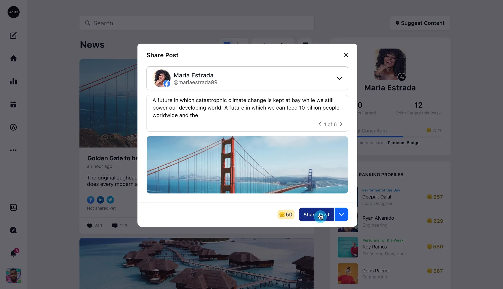
The advocate opens a post, browses the pre-defined captions, tweaks one inline if they want, sees a live preview, and shares, with Sprinklr’s advocacy reward (the coin badge) attached.
Admin · the Campaign Control Center
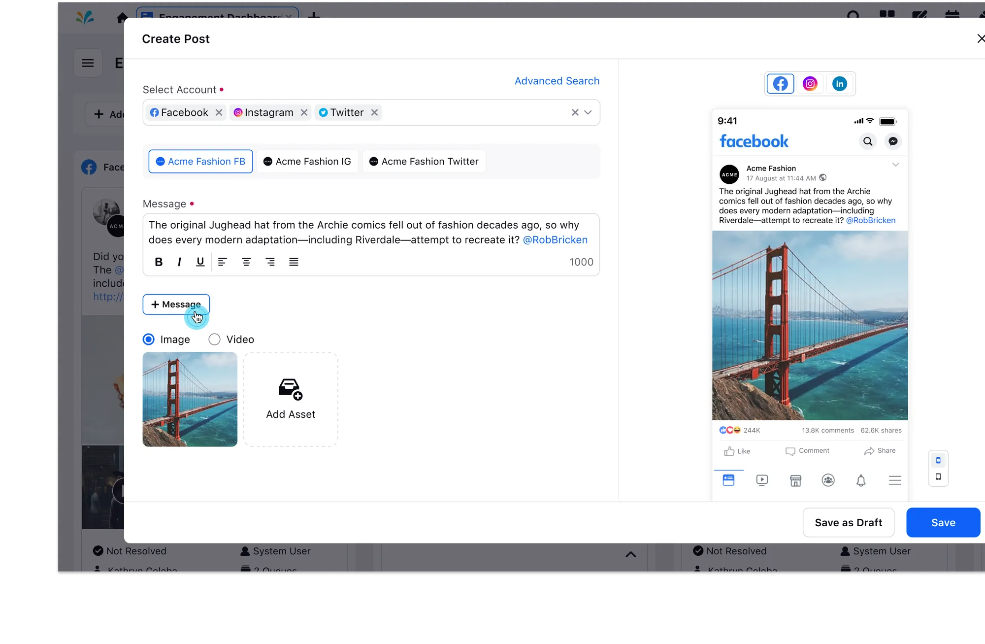
- 1Tailor the caption per channel. Facebook, Instagram, and Twitter each get their own.
- 2“+ Message” adds another caption option for advocates to choose from.
- 3Live preview of exactly what will publish.
Advocate · the Share flow
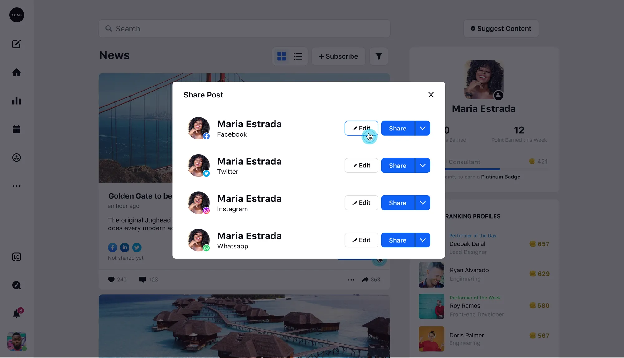
- 1Each connected channel is its own row.
- 2Edit any caption inline to make it sound like you.
- 3Share to each network independently.
The iteration
Made to look easy, which was the hard part
The final screen looks obvious; getting there took many rounds, each failing for a specific reason. The brief kept moving under me. Captions had to vary per platform, a coin reward landed late, so a real part of the work was staying ahead of requirements that never stopped arriving. Challenging, and honestly the fun of it.
Exploration 1
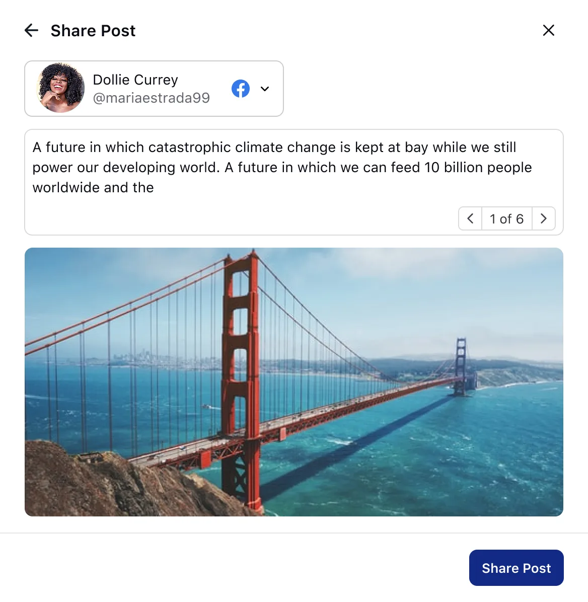
It followed the design system cleanly, and missed the one thing that mattered: advocates couldn't edit. Editing wasn't a nice-to-have, it was the whole point.
Exploration 2
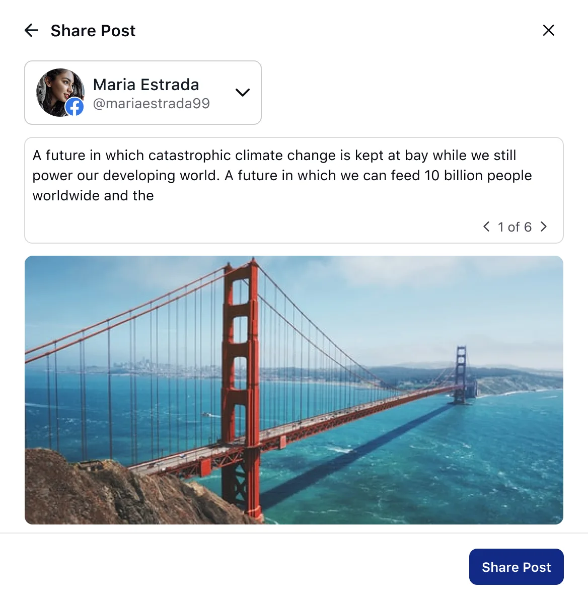
A cleaner pass, but you still saw one caption at a time, clicking through all six and comparing from memory. Tidy modal, real mental work.
Exploration 3
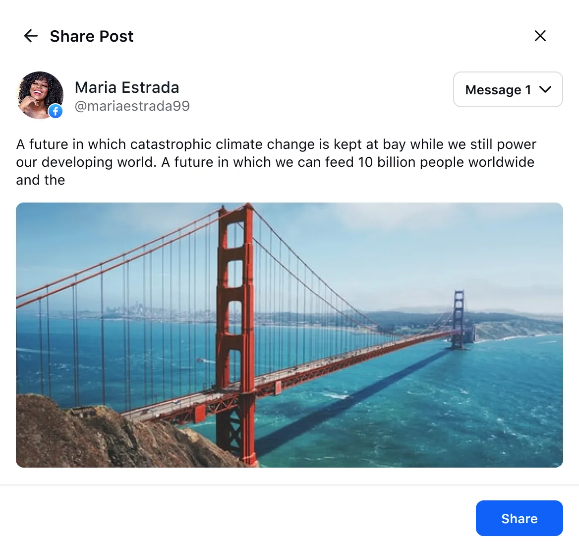
Same idea, pushed further, but paging through captions to compare never got less tedious. The browse pattern itself was the problem, not the polish.
Exploration 4
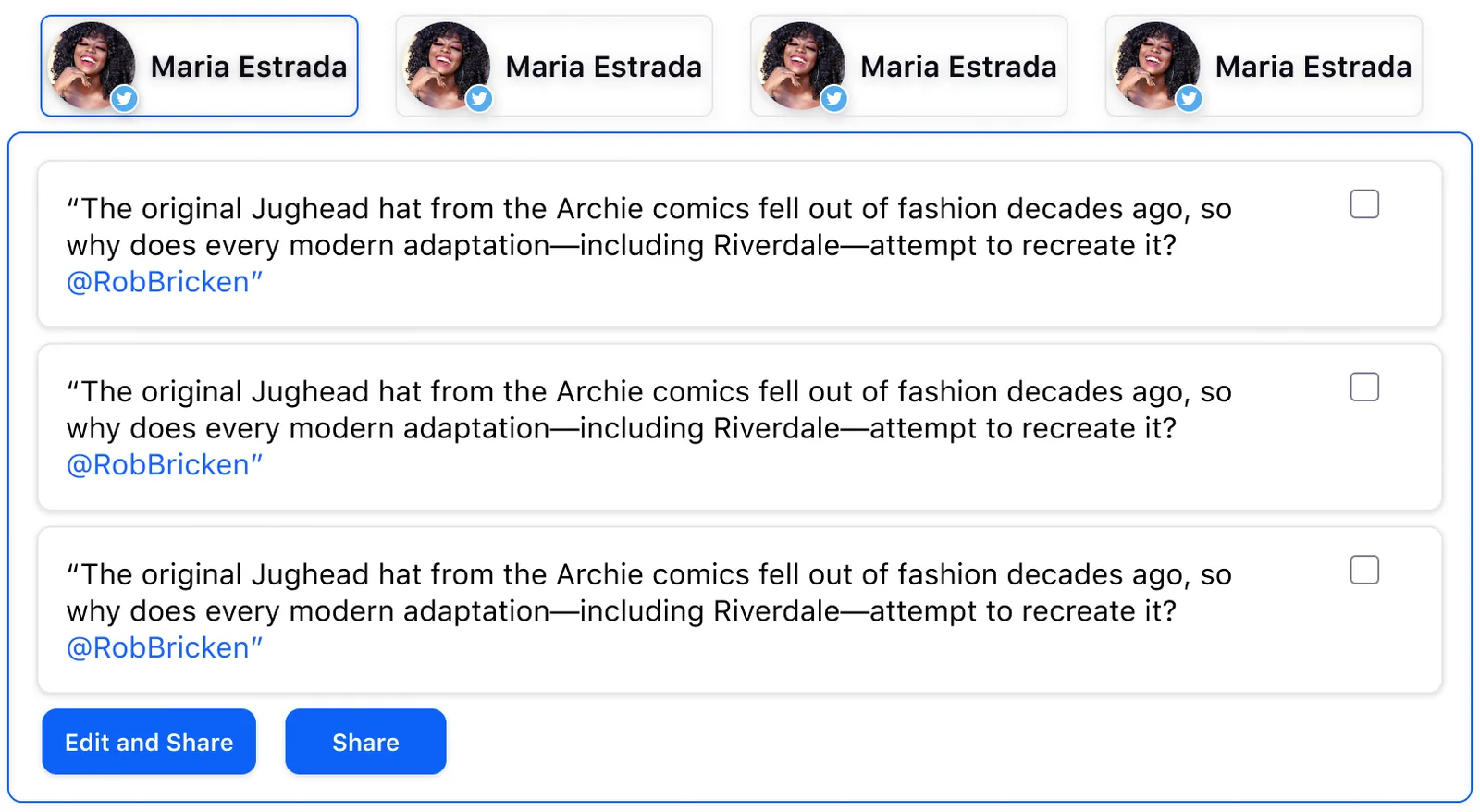
I'd nailed the flow for switching between channels, then the PMs came back: captions had to vary by platform, not just carry across them. Reuse isn't the same as fit.
Exploration 5
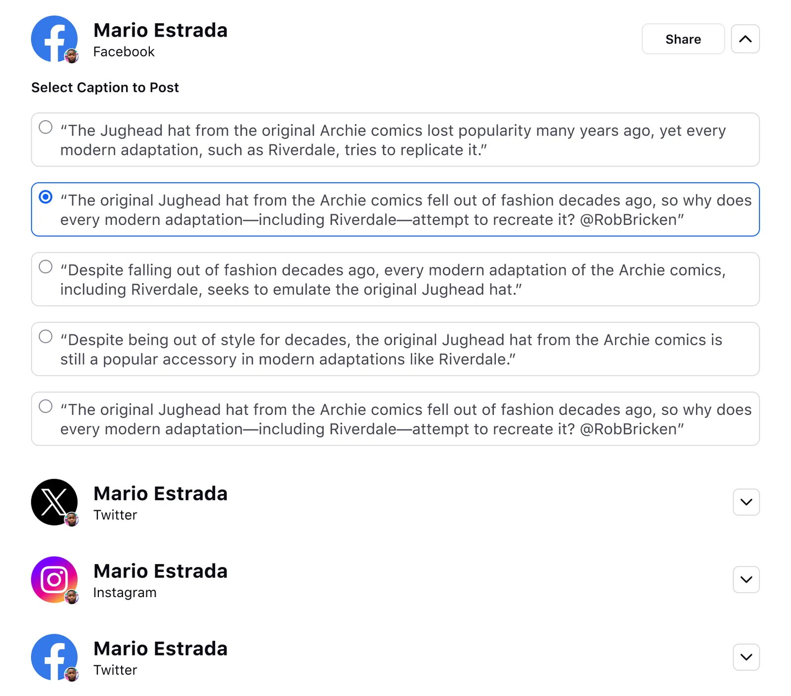
You could finally compare captions, but choosing one per channel turned sharing into filling out a form, and radios left no room to write your own.
Exploration 6
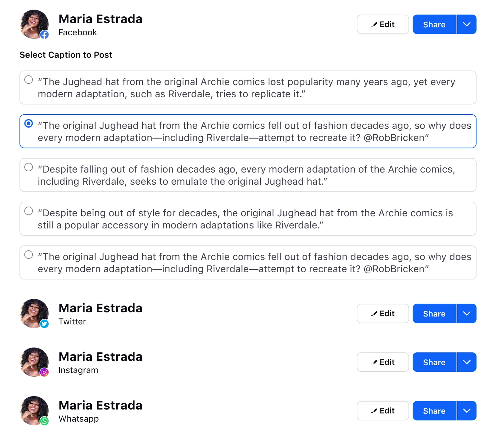
So I surfaced everything at once, nothing hidden, nothing to hunt for. But “complete” read as overwhelming, and it would only get heavier once editing was added.
Exploration 7
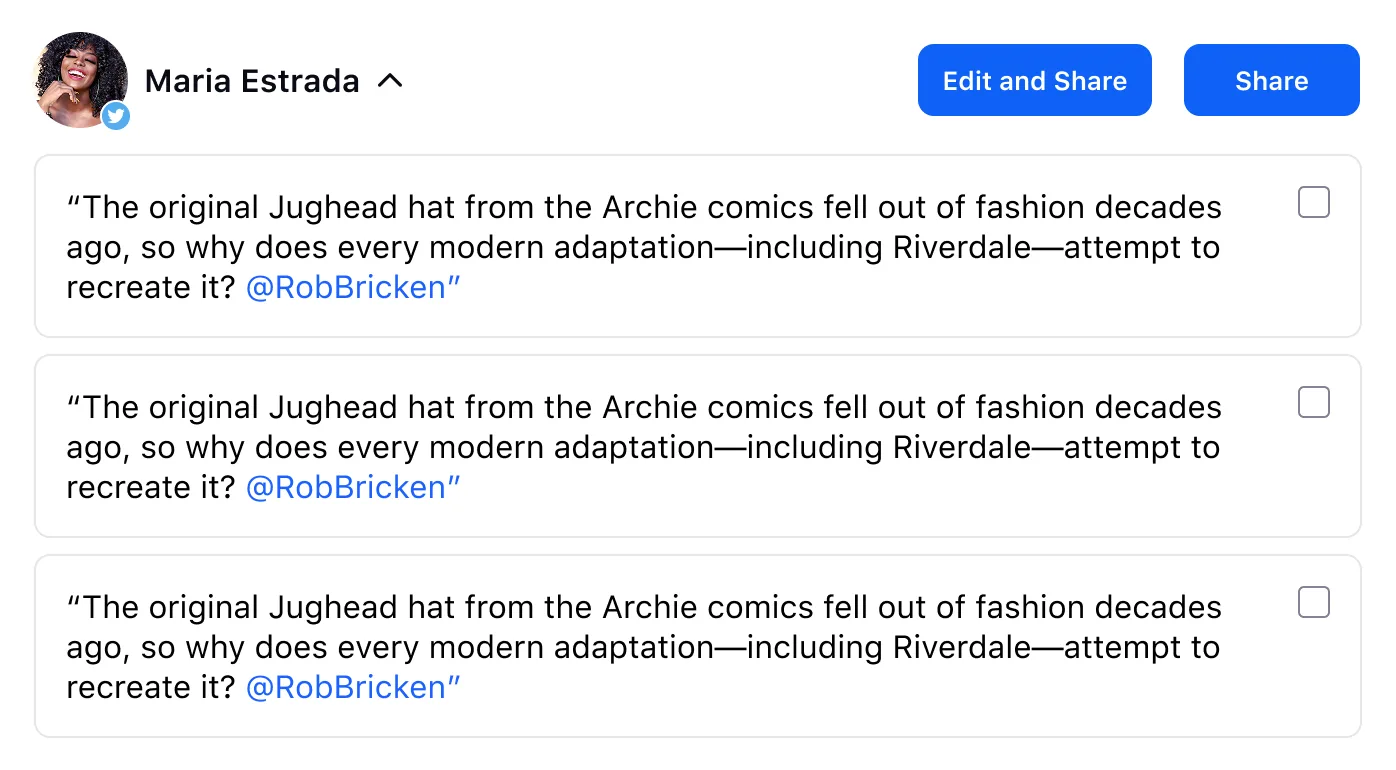
Checkboxes implied you could pick several captions, but you only post one. And two co-equal buttons forced a fork before you even knew what you wanted.
Exploration 8
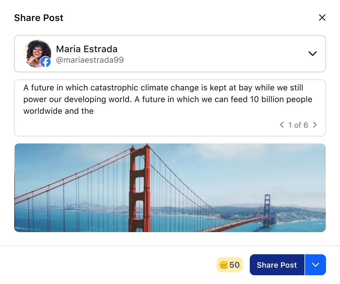
The answer was a ready default with power one tap away. Browse pre-defined captions, or edit inline to make it yours. Effortless for whoever just wants to post; personal for whoever doesn't. The coin total in the footer came late, added to match Sprinklr's advocacy gamification.
“Every round failed for a specific reason, and each reason was a requirement about editing or scale I hadn’t heard yet.”
Outcomes
What it moved
On the numbers: tracked post-launch by the customer success and product team.
“Personalization makes advocacy effortless.”Advocate, user interview
Reflection
The hardest features are the ones that have to look easy
- Friction is the enemy of participation. Every extra tap to share cost a share, so cutting steps moved the numbers more than adding features ever could.
- A strong default beats a menu.Advocates didn’t want six captions to weigh up; they wanted one ready to post, with the freedom to edit it. Get the 80% path right and most people never need more.
- Build for a brief that keeps moving. Requirements never stop arriving; a pattern that absorbs change outlasts a screen that breaks under it.
- Zoom out. I was designing one modal, but it only worked once I understood where it sat in the whole advocacy product.