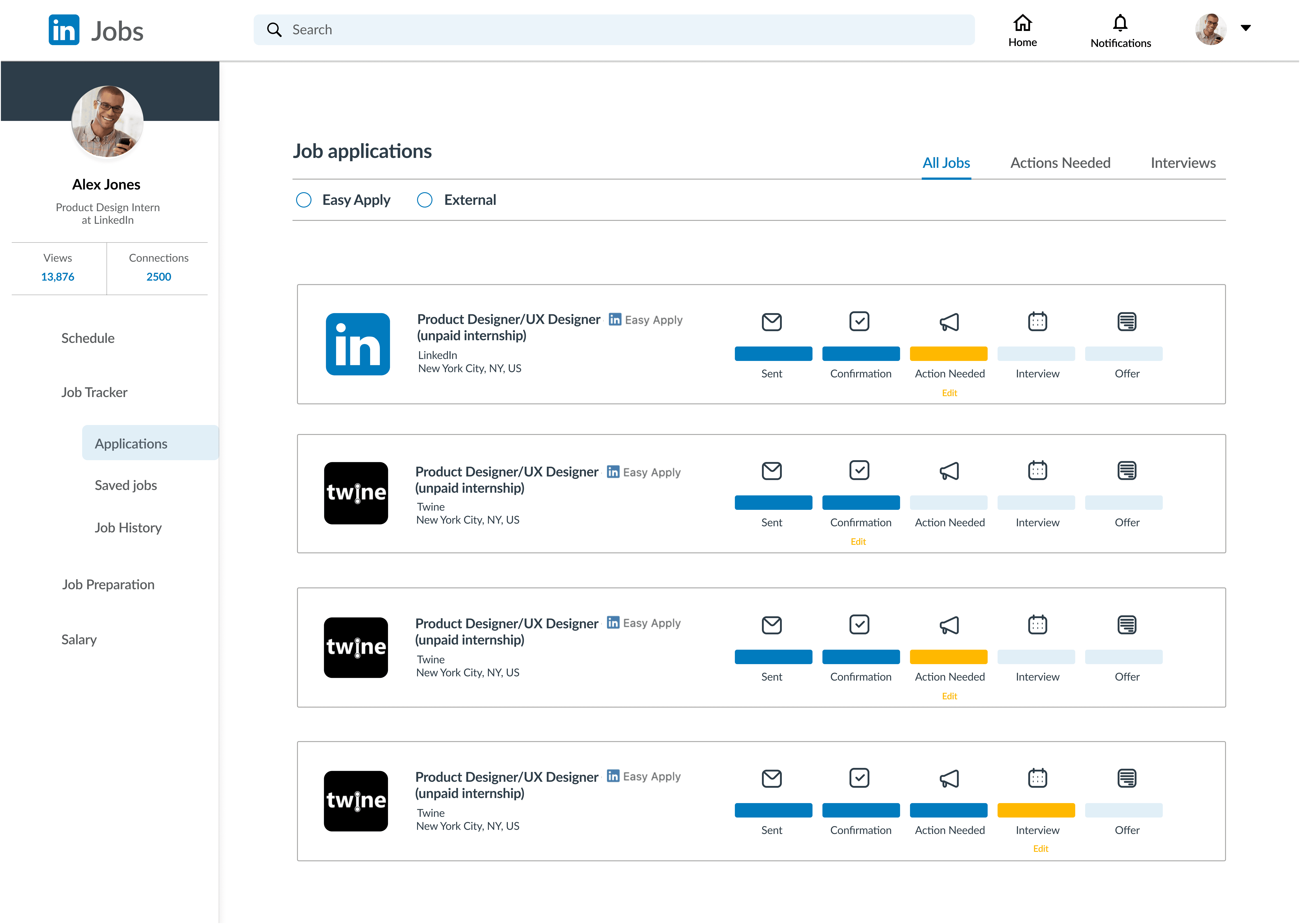
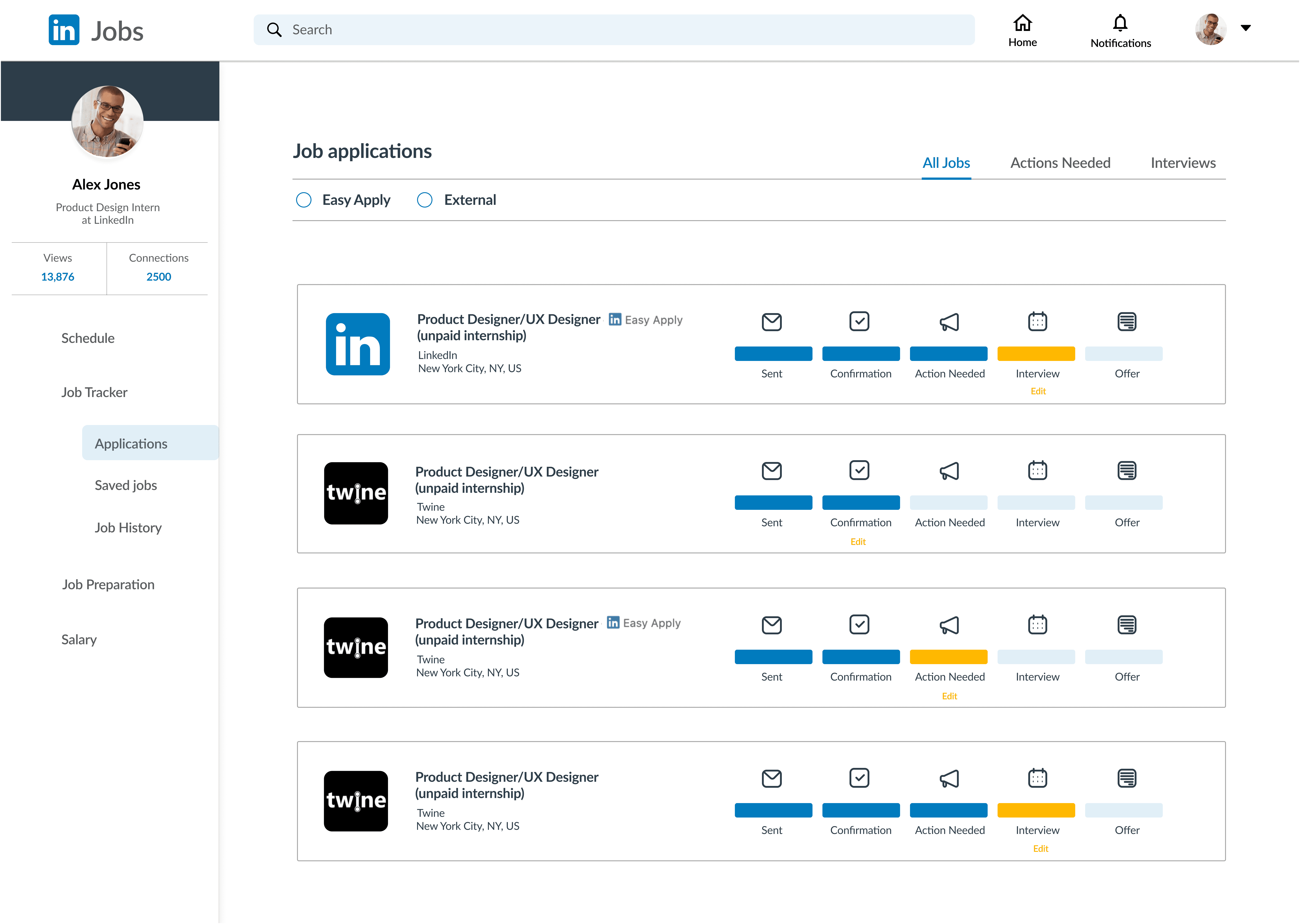
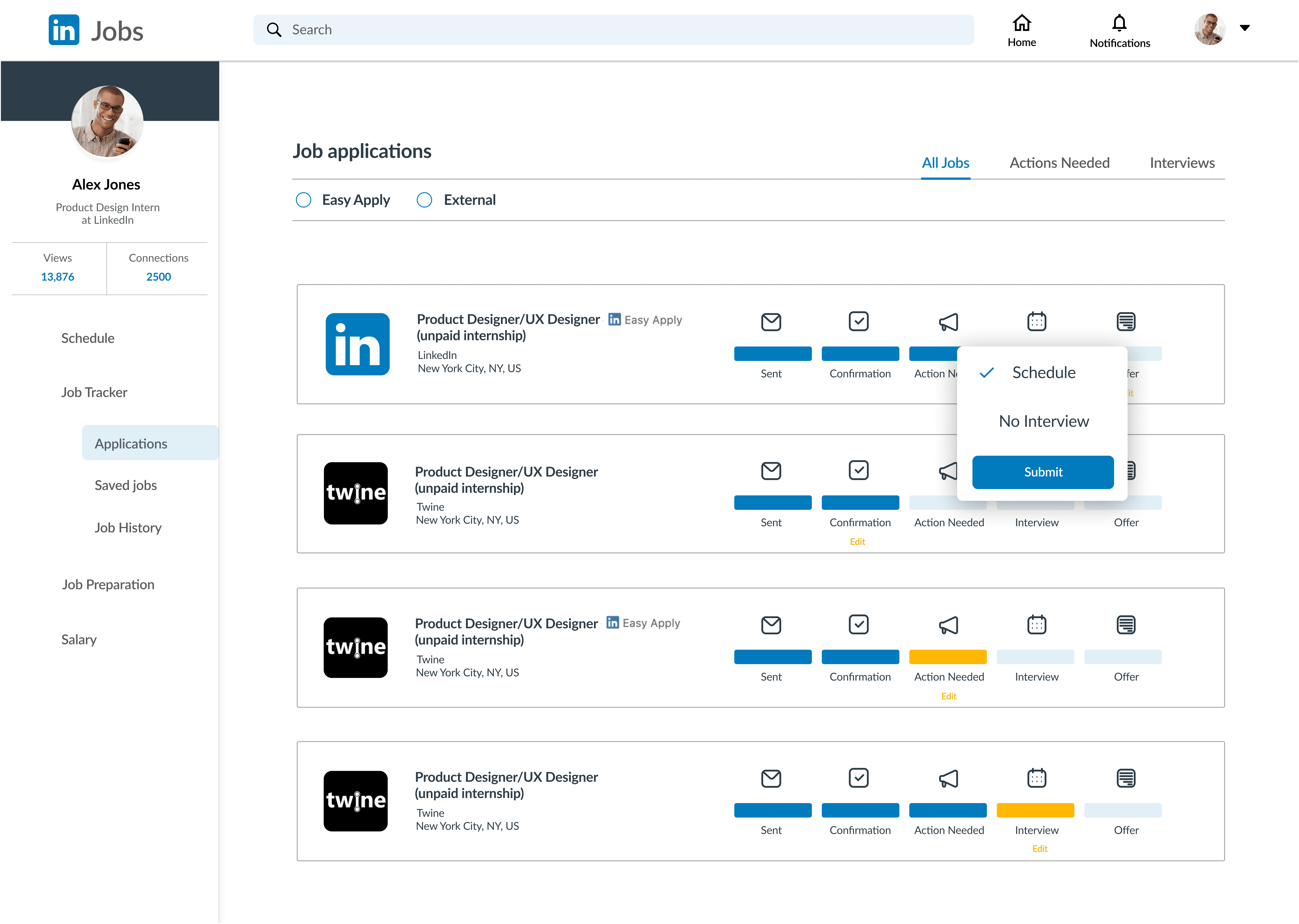
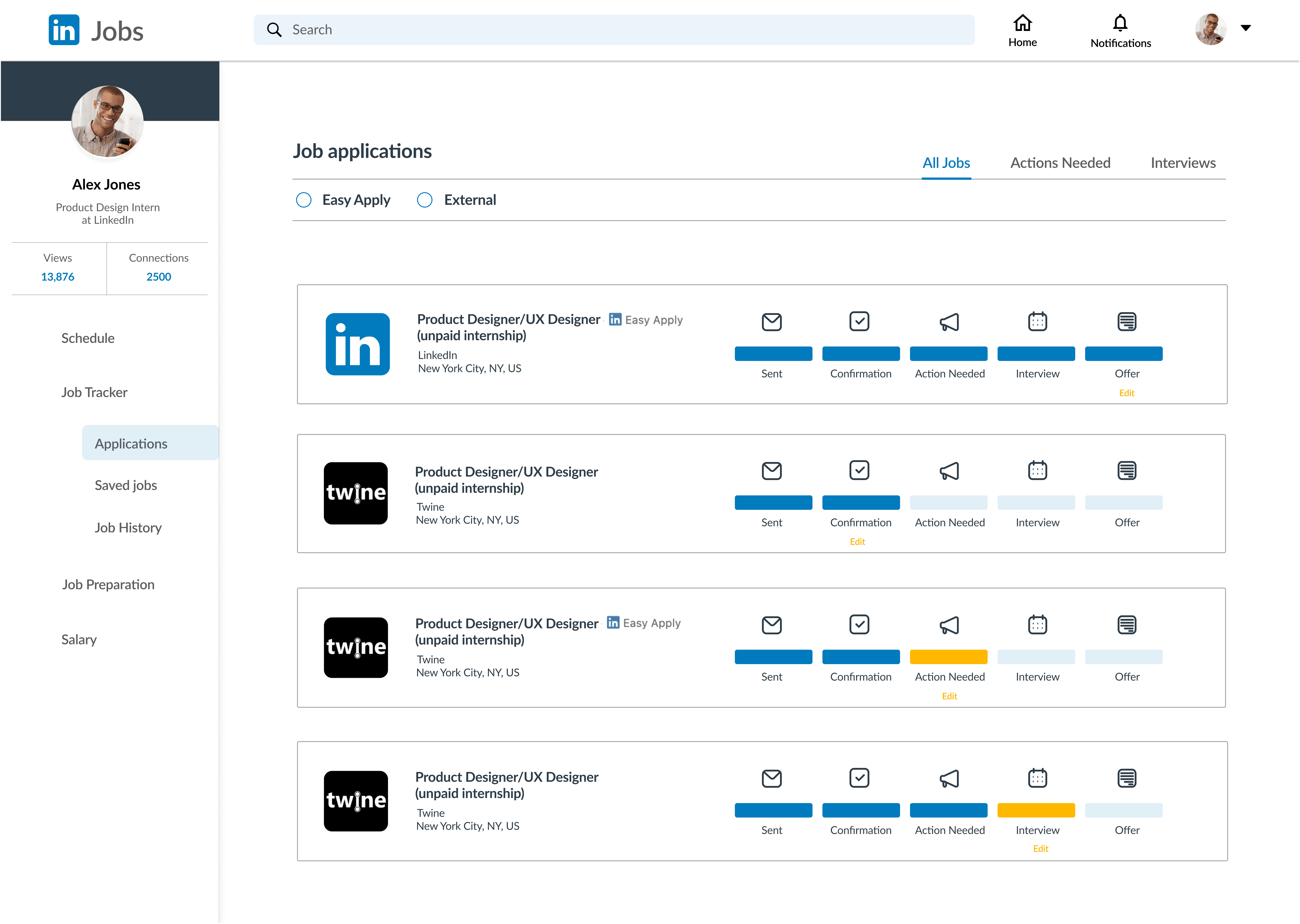
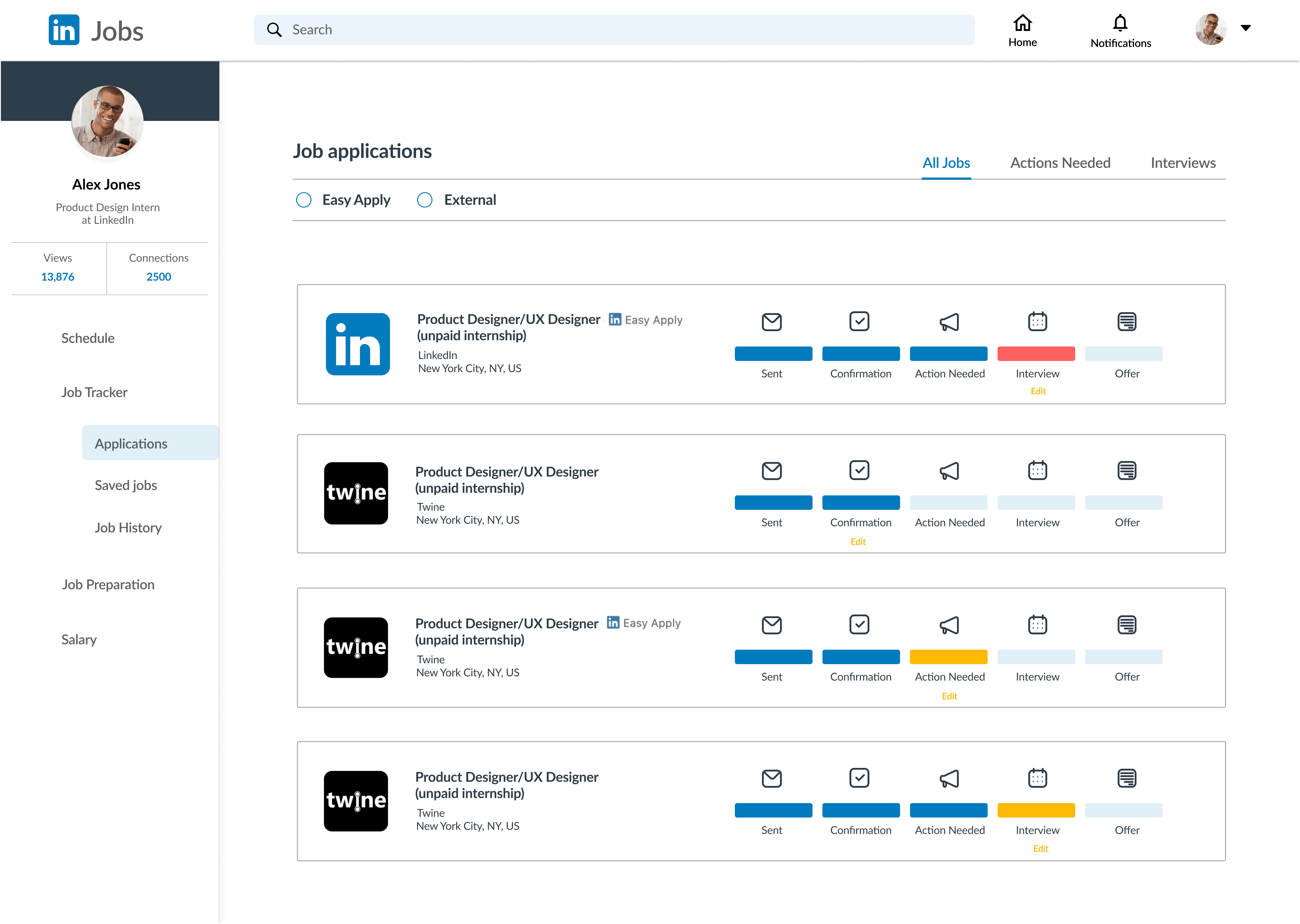
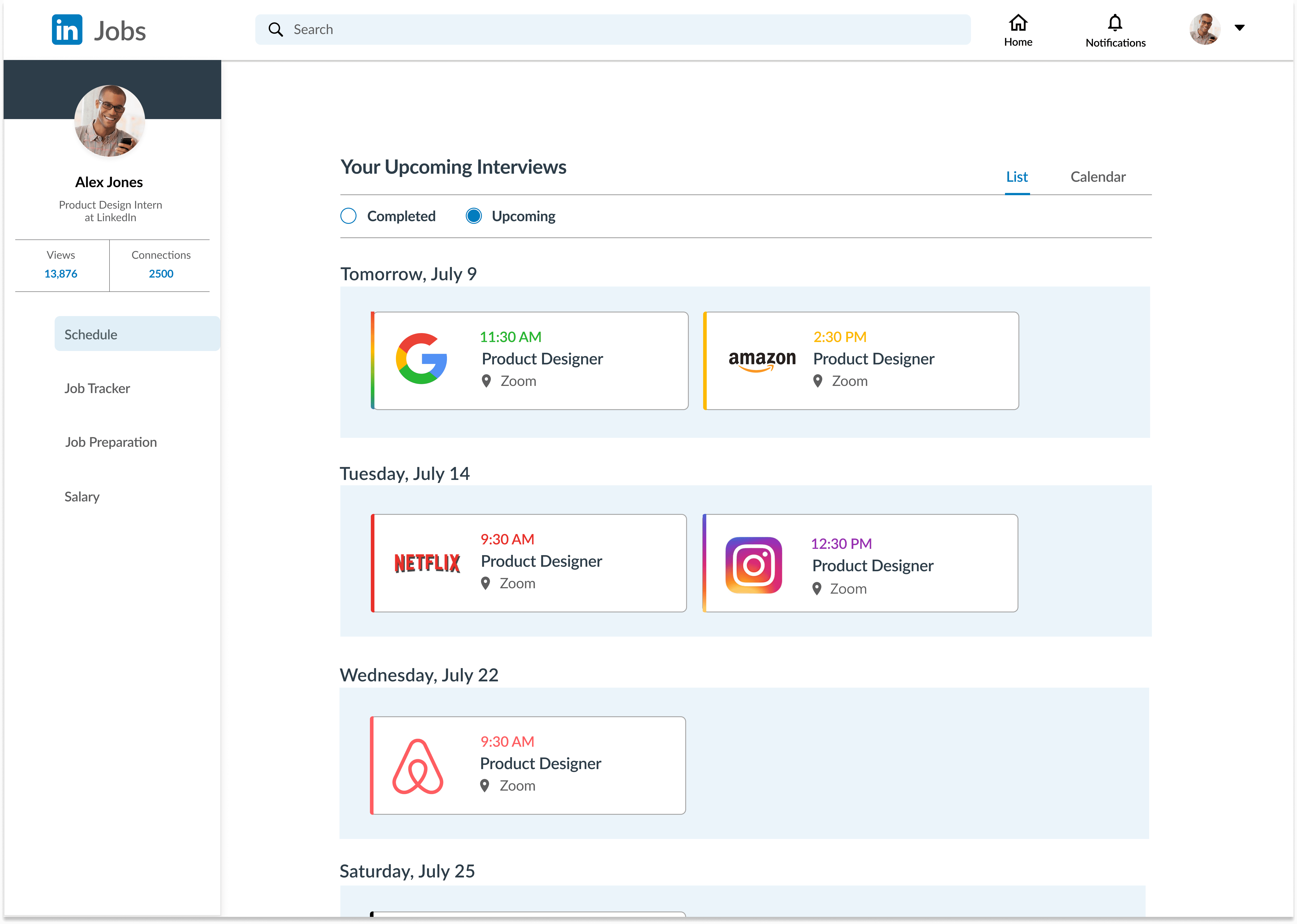
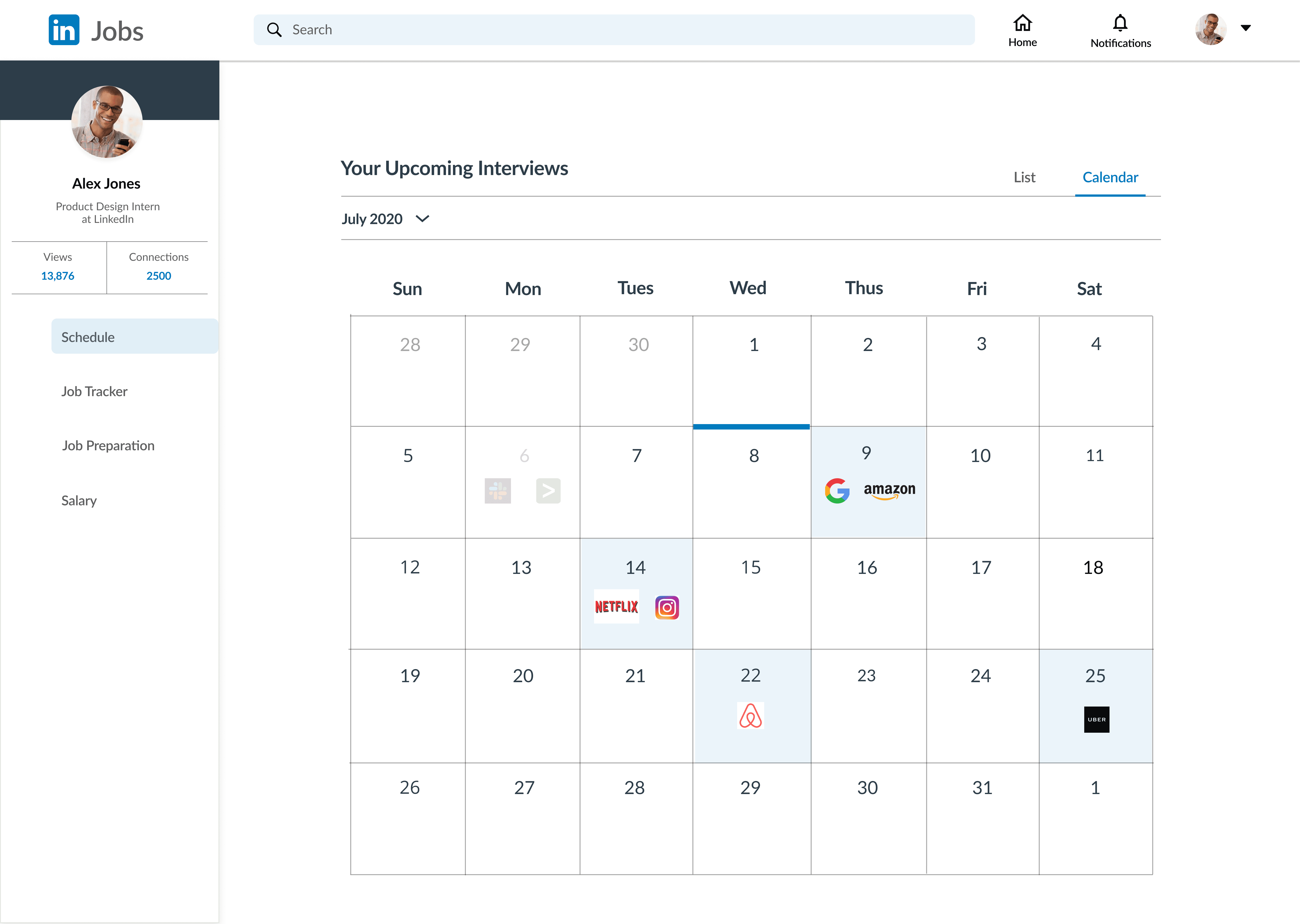
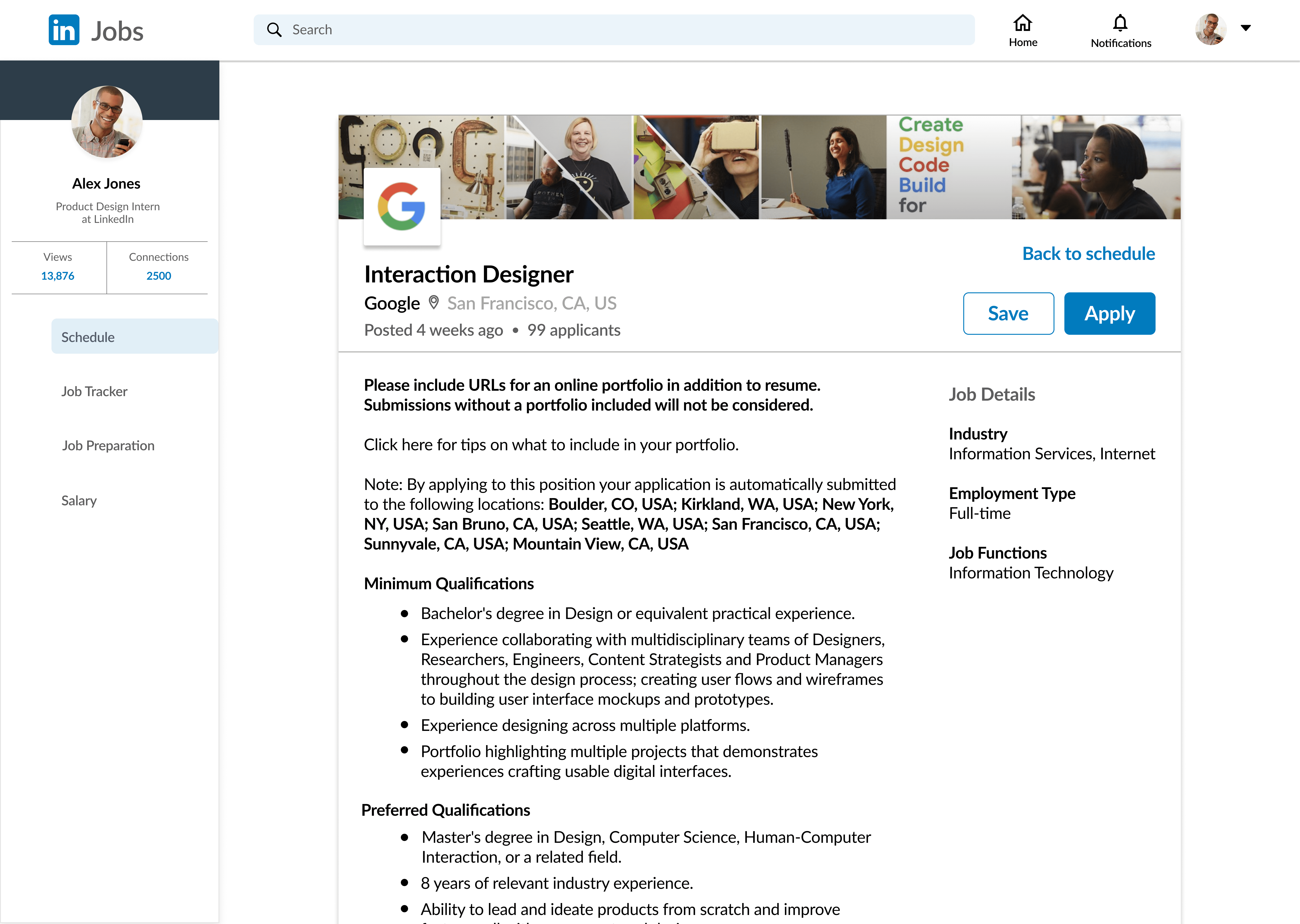
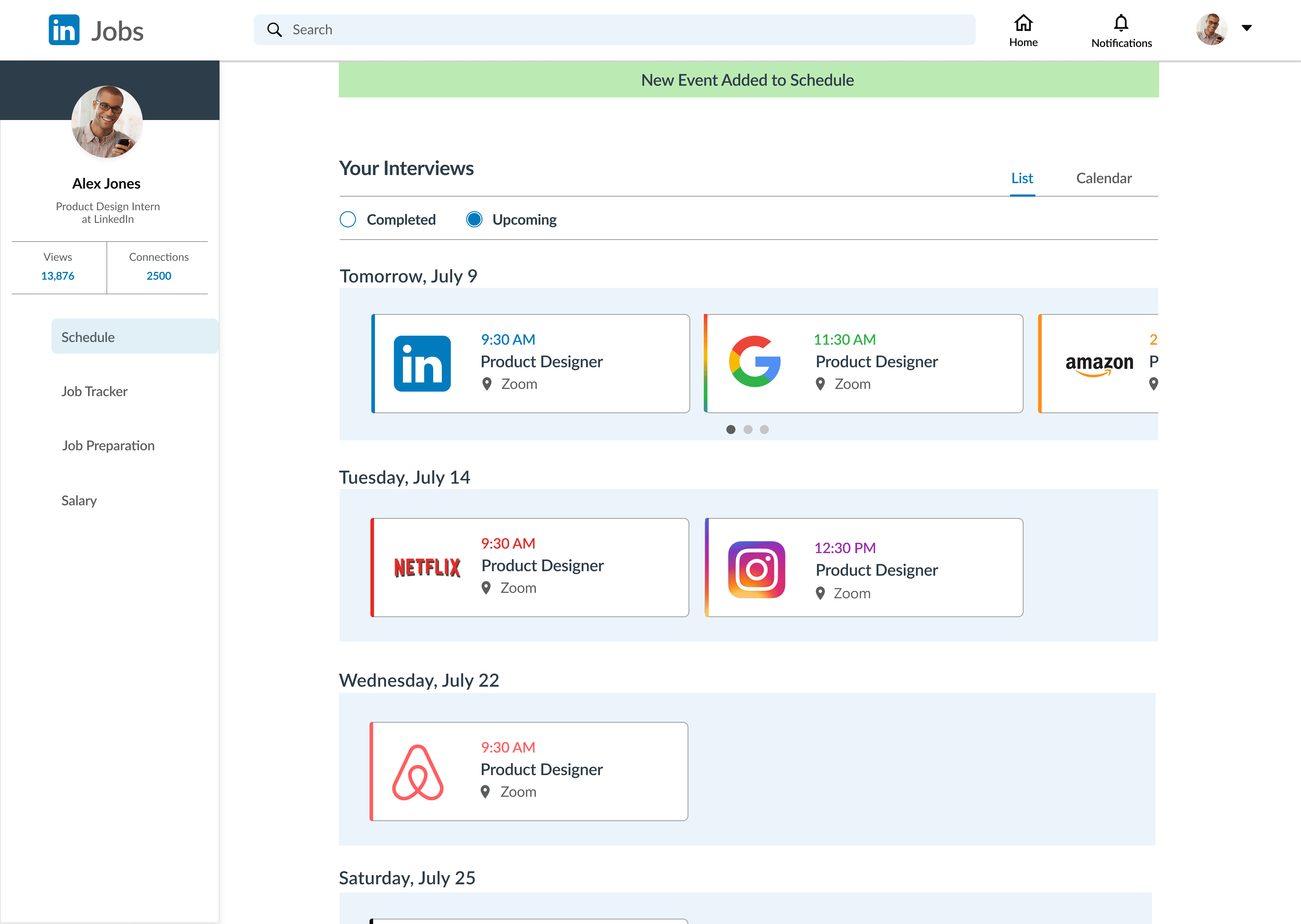
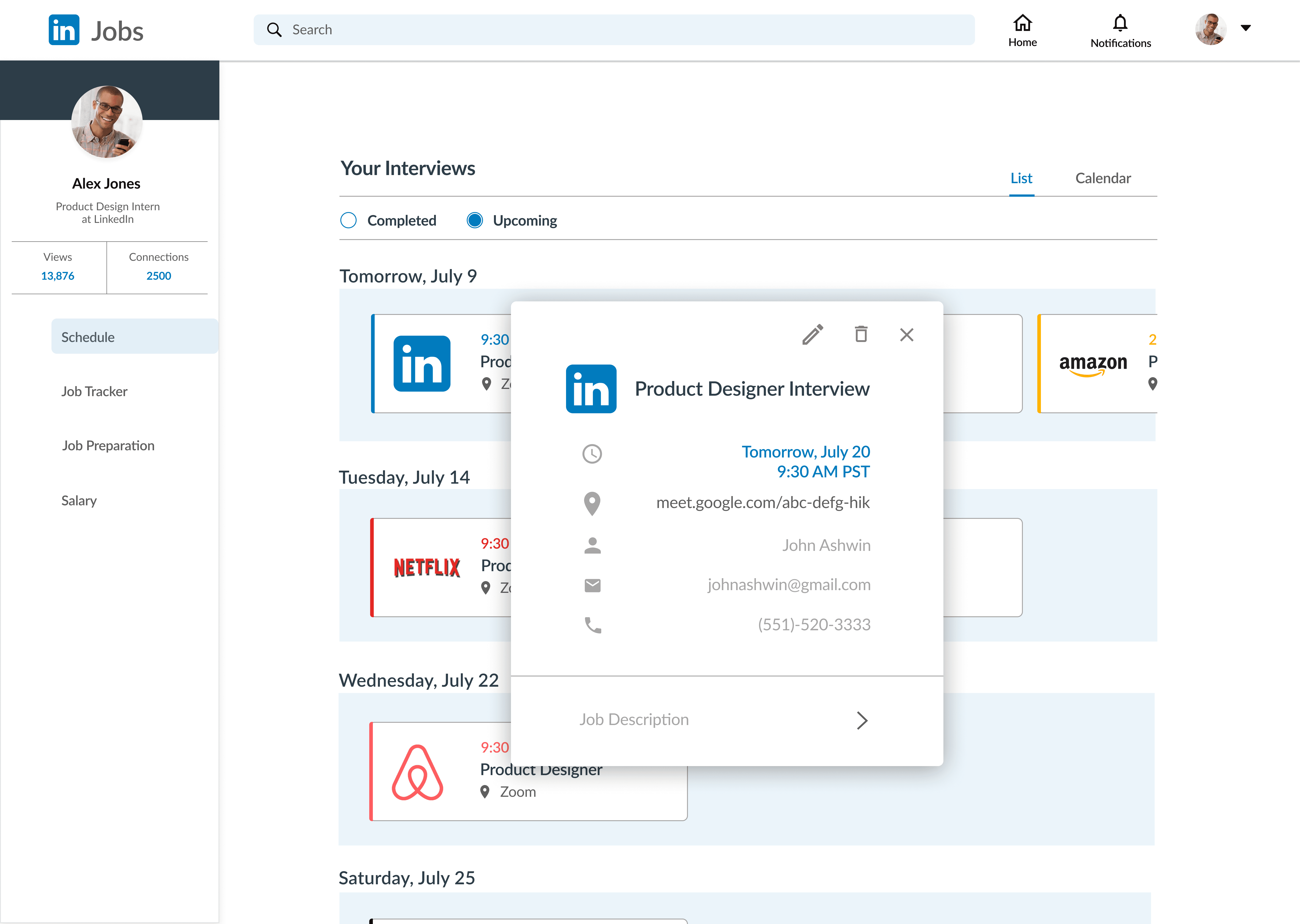
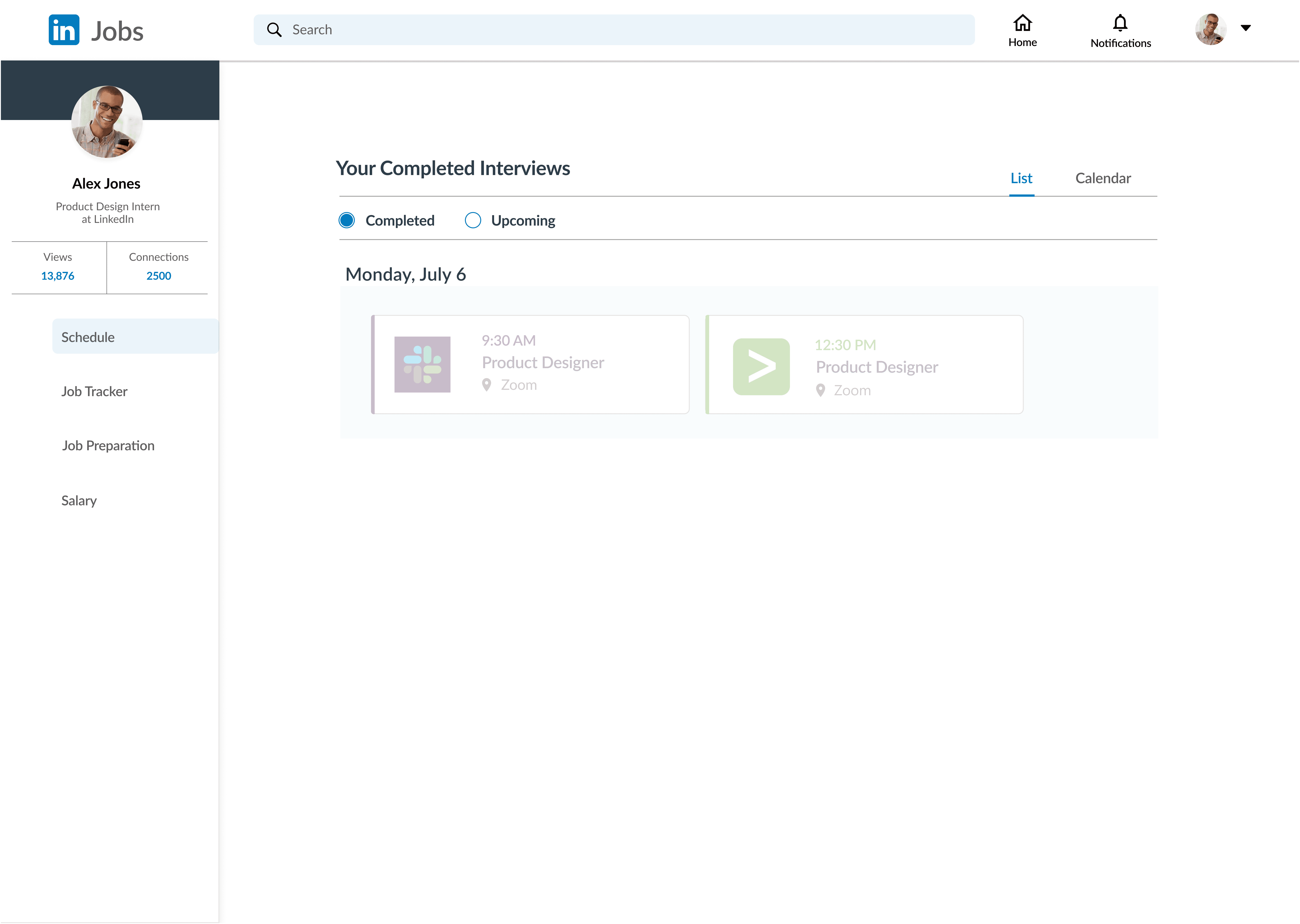
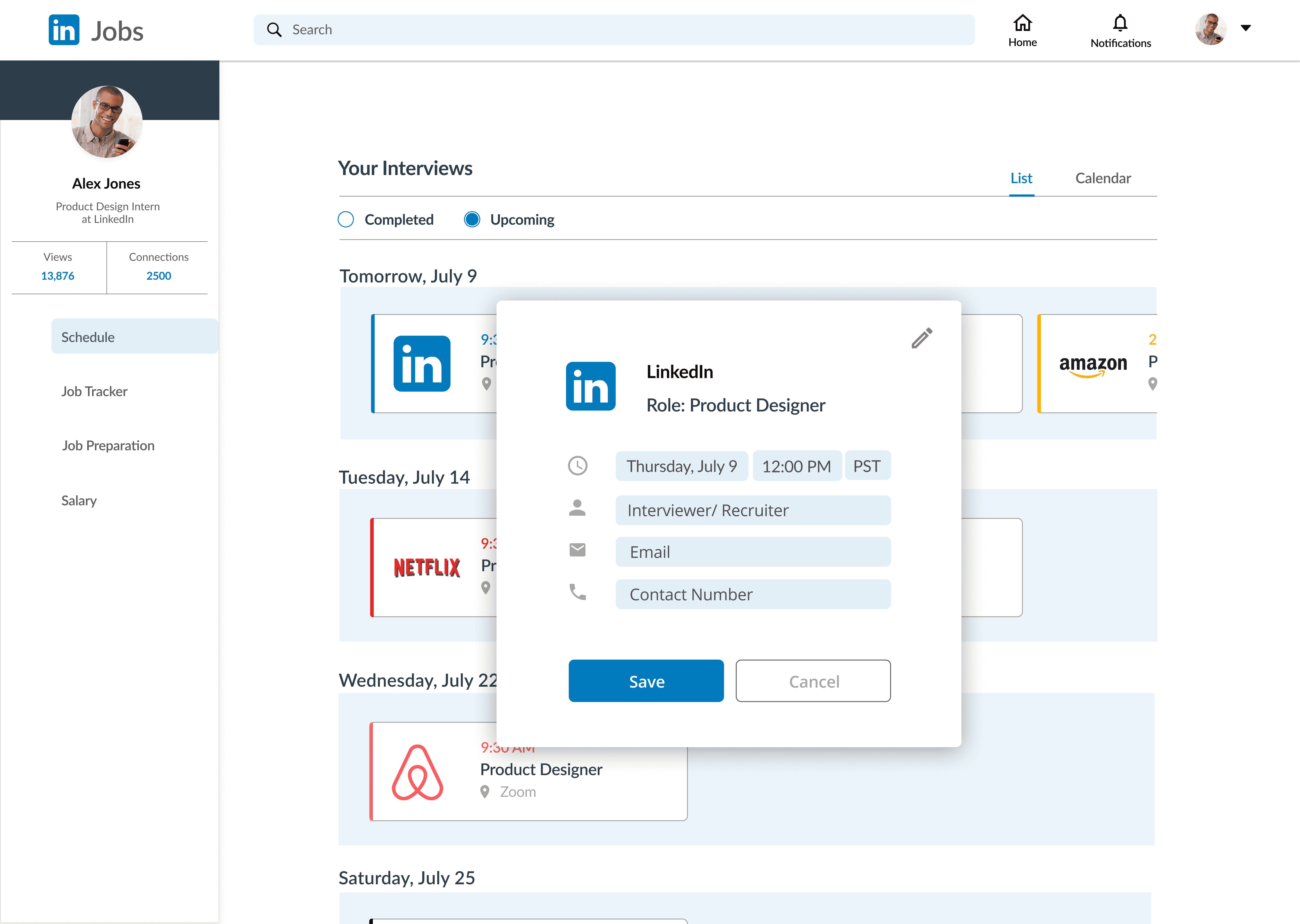
The job search shouldn’t feel like a juggling act. I initiated this project with a small team of four designers to reimagine LinkedIn not just as a place to find jobs — but as a single, empowering hub to apply, schedule, and track everything in one flow. This concept introduces two new features on LinkedIn to bring the entire job search journey into one place.
Challenge
The job hunt isn’t broken because people aren’t trying — it’s broken because it’s scattered. Applicants switch between tabs, inboxes, spreadsheets, and calendars just to keep track of interviews and next steps. LinkedIn helps users discover opportunities — but not manage them.
Results
Two new LinkedIn features make the job search seamless:
Unified Job Tracker — One timeline for applications and interviews.
Interview Scheduler — Schedule directly within LinkedIn.
↓50%
Potential Tool Switching
1
Timeline for Job Seekers
↑
Elevated Platform Value
↑
Streamlined Scheduling
How might we reduce friction for job seekers by unifying the fragmented application, scheduling, and tracking process into one seamless flow?
In the Shoes of a Job Seeker
The job search isn’t just hard to organize — it eats time and energy. Job seekers juggle calendars, emails, spreadsheets, and multiple portals just to keep up. The friction isn’t just in finding the job — it’s in holding everything together afterward.

Surveys, interviews, personas, and flow mapping surfaced core friction points across the hiring journey, shaping the direction for our design opportunities
When every tab feels like a task, things slip
Research and Interviews revealed a consistent pattern - the real pain wasn't finding jobs, but holding it all together afterward.
“I spend more time tracking where I am in the process than actually applying.”
-Junior Applicant,
“Once I hit ‘Apply,’ everything feels like it disappears into thin air.”
-Mid-level Applicant


Design Opportunities
Make the work feel seamless, not scattered.
By consolidating applying, scheduling, and tracking into a single experience, LinkedIn can own the full journey, not just the starting point.
This friction isn’t one-sided. Reducing complexity for both candidates and recruiters creates a more connected hiring experience.
“Half my job is just chasing people to lock in a time. Why isn’t this already in LinkedIn?”
-Recruiter,
startup
“Coordinating interviews across email threads and calendars is a nightmare. A built-in scheduler would save everyone time.”
-Recruiter,
mid-size tech company
HMW:
How might we reduce friction by unifying applying, scheduling, and tracking into one flow?
HMW:
How might we make scheduling effortless and eliminate endless back-and-forth- turning it from a manual task into a seamless in-platform flow?
Building Smart, Not Big
Rather than tackling every pain point at once, I shaped a focused MVP strategy aimed at simplifying the most overwhelming part of the job search: the messy middle between applying, scheduling, and tracking.
Using the MoSCoW framework, I mapped potential features based on
User Pain
What causes the most friction right now
Impact
What delivers the biggest change in experience
Feasibility
What can realistically be launched fast
This allowed me to draw a clear line between what needs to exist now and what can grow over time, setting the stage for a lean, high-impact launch.

Why this matters:
While the broader opportunity spans both candidates and recruiters, the MVP strategically focuses on job seekers — addressing the most immediate friction first and laying the foundation for future recruiter-facing features.
Experience Architecture: From Chaos to Clarity
Before defining the visuals, I focused on designing the experience — prioritizing usability and building a flow that feels natural, reduces friction, and gives job seekers back their focus. Low- to mid-fidelity wireframes laid the foundation before finalizing the design.


Design in Motion: Validating Flows Before the Pixels Land
I tested the flow with five participants to see how users navigated the tracker and scheduler. The flow worked — but the visuals didn’t. Too many colors, mismatched layouts, and blocky screens broke continuity.
The real issue wasn’t the design itself, but the lack of alignment between two designers. Testing exposed those gaps and set the stage for a shared style guide.

A Familiar Language, Fine-Tuned
Building on LinkedIn’s existing UI, I refined hierarchy, spacing, and color to reduce noise and sharpen focus. Subtle adjustments made the experience feel cleaner, more intuitive, and better aligned with user expectations.

This project made one thing clear: great design depends on alignment, not just clean flows. Visual mismatches, inconsistent layouts, and color overload traced back to late communication and missing systems.
Catching those gaps early reshaped how I approach structure, collaboration, and design systems — setting a stronger foundation for future work.
Key Takeaways
Communication First: Early alignment between designers could’ve prevented visual fragmentation.
Systems Thinking: A shared foundation ensures consistency across evolving features.
Testing Over Pixels: Usability testing exposed what mockups alone couldn’t.
Clarity Over Clutter: Visual cohesion isn’t polish — it’s part of the experience.
Next Steps
Build Early Systems: Introduce a design system at the start to maintain consistency.
Tighter Collaboration: Strengthen design handoffs and shared workflows.
Iterate Faster: Run earlier rounds of usability testing to guide visual decisions.
Scale Thoughtfully: Expand features with clarity and structured growth in mind.

